Bark Up is an app connected to a GPS tracker. The product allows people to track down wayward pets who may have got lost, ran away or been dog-napped. It shows the fastest route with a clean, simple user interface.
As the only designer responsible for this project - I led both, the user research and visual design. I conducted multiple rounds of research to discover if there was a user need for a product like this. I identified key user groups and key tasks, produced sketches, wireframes and prototypes. Validated the hypotheses and iterated on the product.
Bark up is aimed to be a safety device as well as tracking one. Both answering the urgency of a lost pet, and the need reassurance of their position and health.
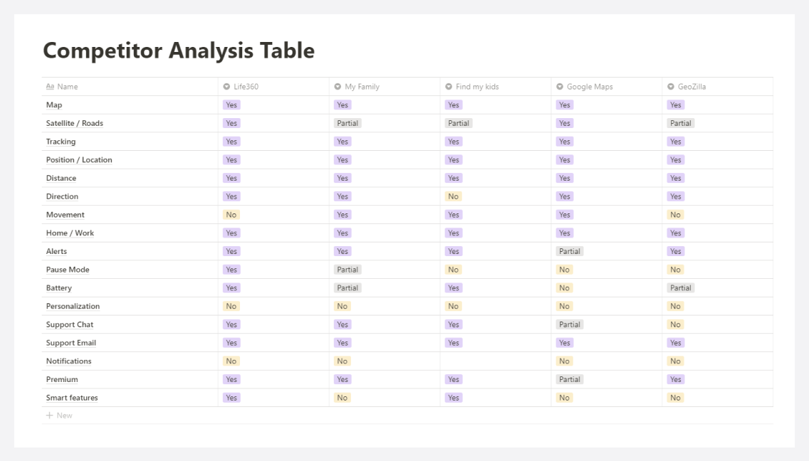
Starting with a competitive analysis helped me understand who are and who could be the competitors of Bark Up. Knowing where you stand with your project is a crucial part of getting things right. Bark Up doesn’t have a true competitor, so I looked at other tracking apps, like family & relatives locator, running tracker. It helped tremendously to find the right features to build the MVP.
After the competitive analysis, I felt like it was time for interviews to research the attitude of the possible future users and look for potential directions. I interviewed 10+ people in different parks to evaluate the need for the product.
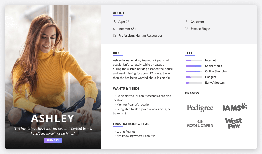
Based on the field visit, I found that 2 groups stood out: pet owners that are afraid of losing them and professionals pet walkers/sitters. Personas are a great way to design for someone that isn't you. The primary persona here is Ashley. I knew that if we could answer her needs, most users would be satisfied.
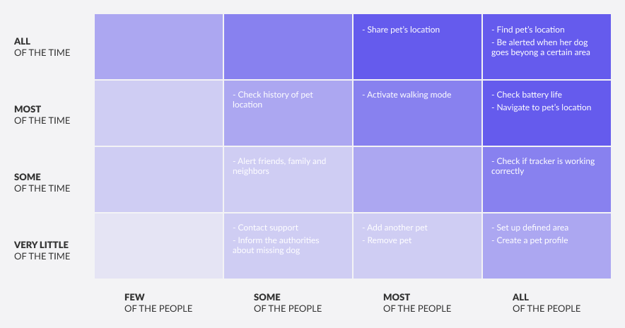
To bring the personas to life a bit more - I created user scenarios. Scenarios are the story of a user performing an action or having an objective with the product. They account for the most popular need of the users. Having the user scenarios fleshed out greatly helped with prioritizing which feature should be build first.
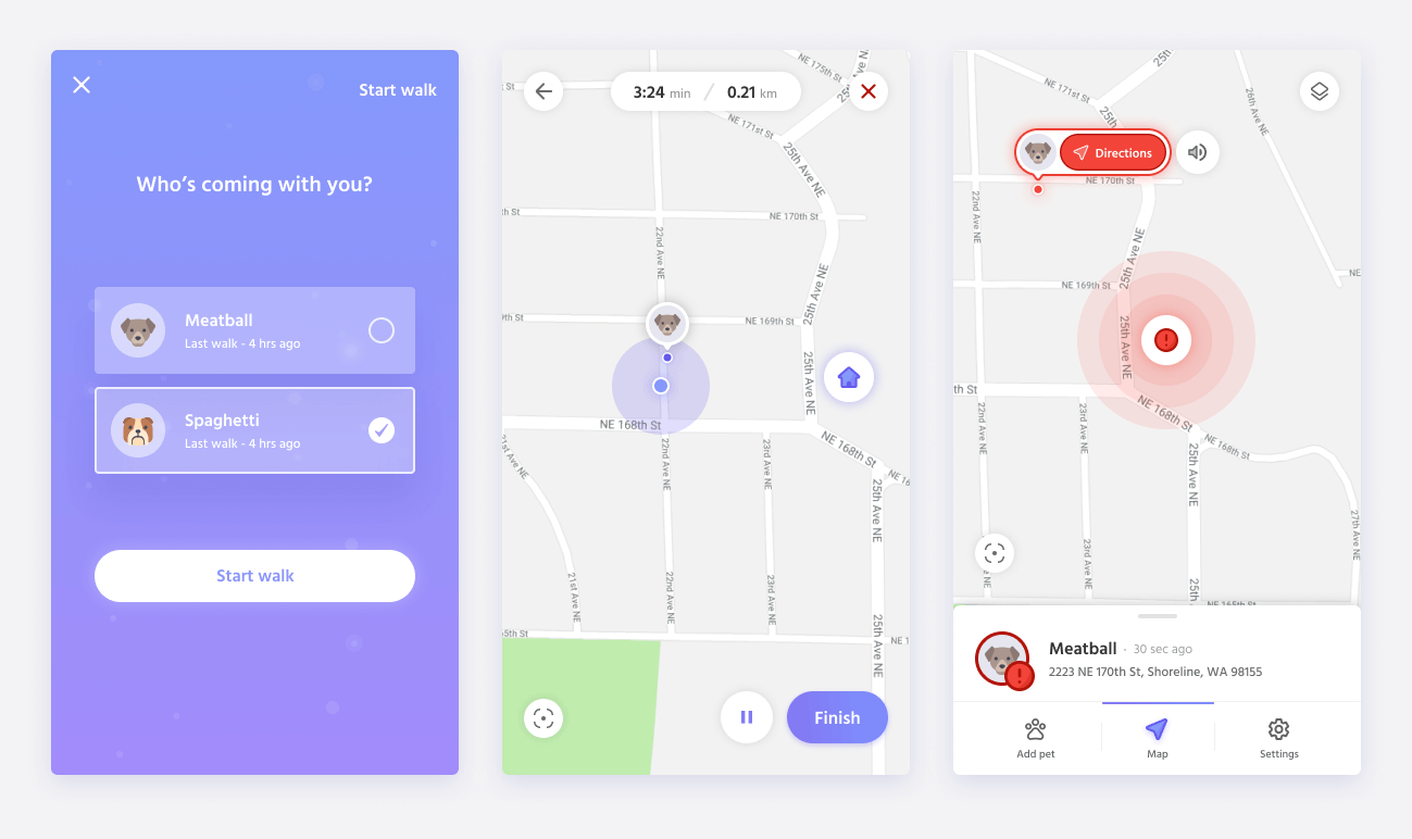
Based on my research findings (user personas, scenarios...) I created the red routes. These routes are the critical and frequent paths that users take to complete their tasks. Red routes are the fundamental journeys that make the product worthwhile. It typically captures 90% or more of the operations of the users. It helps focus on the right tasks.
Once the research is completed - I started thinking about Key Performance Indicators. They are one the safest way to validate a design. Picking a specific KPI is important to learn if your changes actually have an impact. I chose 2 tasks, check their pet location and their vitals.
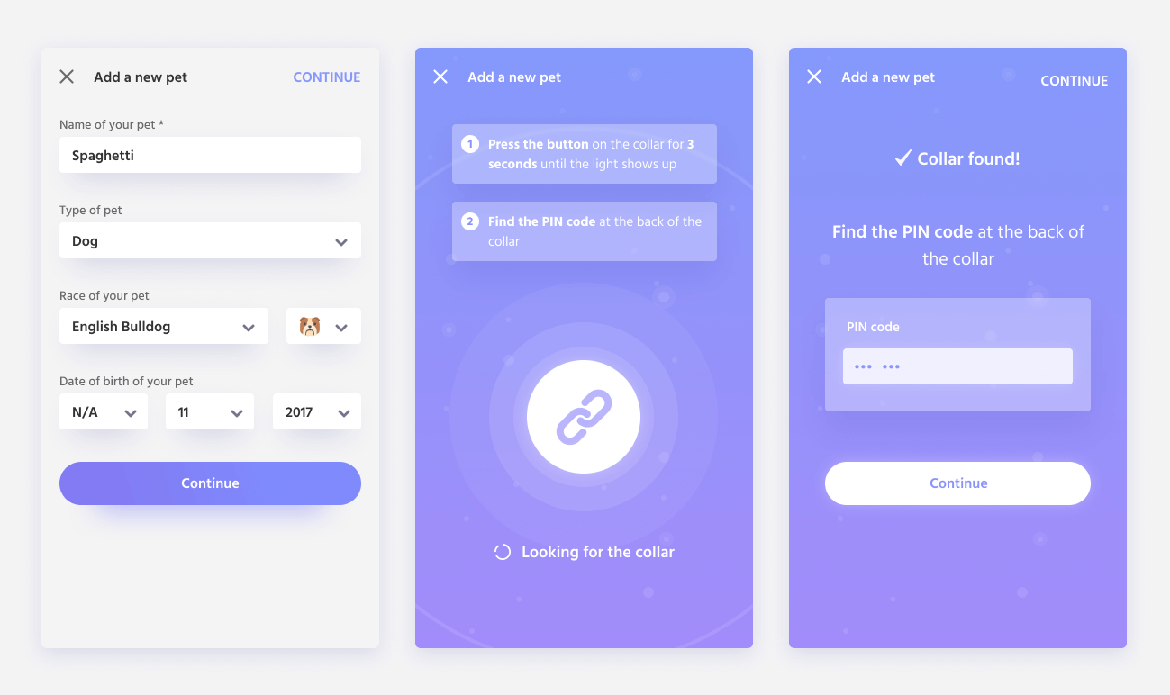
Building the interface is the “easy” part if you have done all the research first. With my previous finding in mind, I started sketching prototypes for Bark Up. I aimed to make the two main paths (finding their pet’s when they get lost, and knowing their location at all times) as easy and simple as possible.
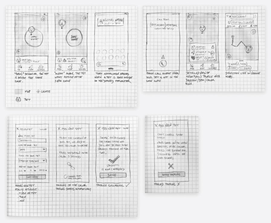
After testing the paper sketches and seeing a solution that worked, I increased the fidelity to wireframes - they can be a bit boring, but it does give the blueprint of what the app will look like. Some adjustments were made to fit increase the accessibility & clarity of the interface.
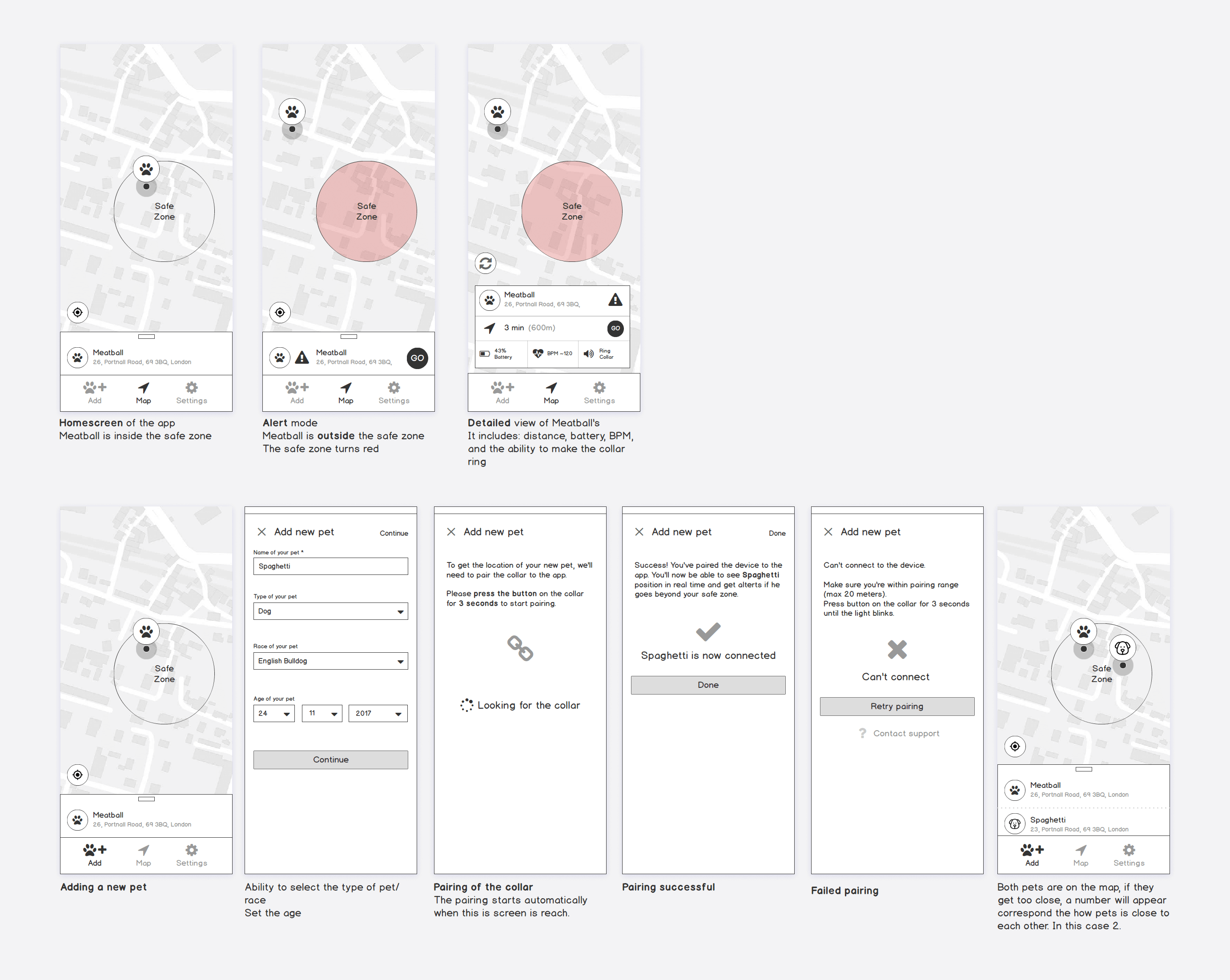
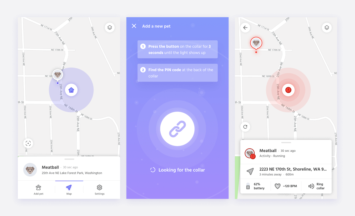
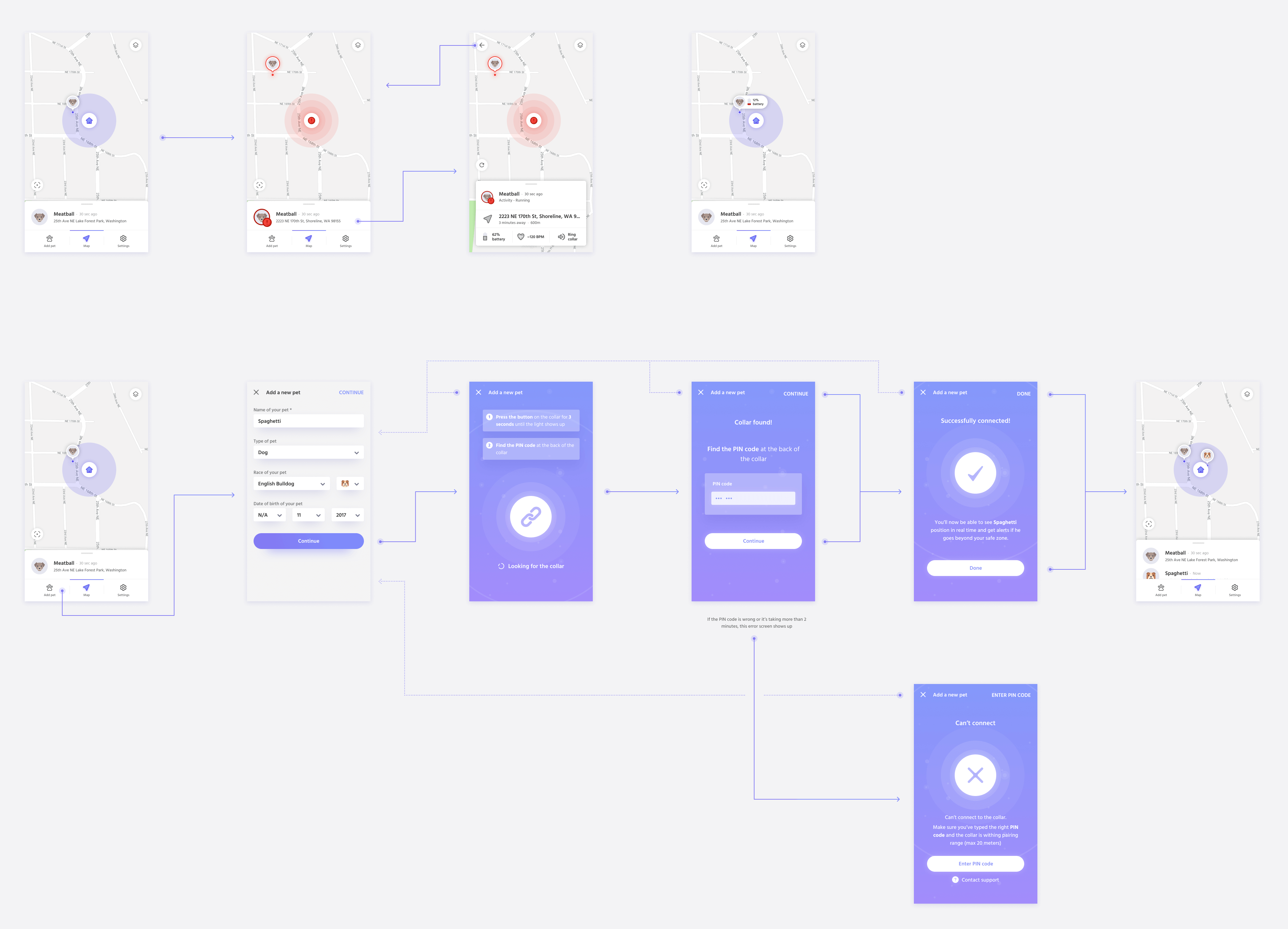
Once we were satisfied with the layout of the wireframes I increased the fidelity again with prototype. The challenge was to keep the interface readable while still giving enough information to the user. I had to make sure that the designs answers the goals:
Usability testing is a key part of understanding the user behavior and creating great user experience. With all the designs ready, I performed a usability testing with 5 users with different background.
As I already tested the while doing the paper prototypes - I was confident that the flow would work. The challenge here was to find out what we missed, what pain points the users had and possible opportunities. To measure the usability I've used Effectiveness (Task Completion Rate) Efficiency (Speed of Use) and Satisfaction (% of users who would recommend the app).
Good design is assured by both the quantitative and the qualitative way of answering questions. Measuring usability helps validate our solutions and display any pain points that the user could have. Here are some of the insights that were discovered during the usability testing phase.
Positive
Opportunities & pain points
The good news was that what've build worked and solved the main user needs. But that doesn't mean that everything is perfect or that we can't improve the product. The observation gave us more insights for future iterations.
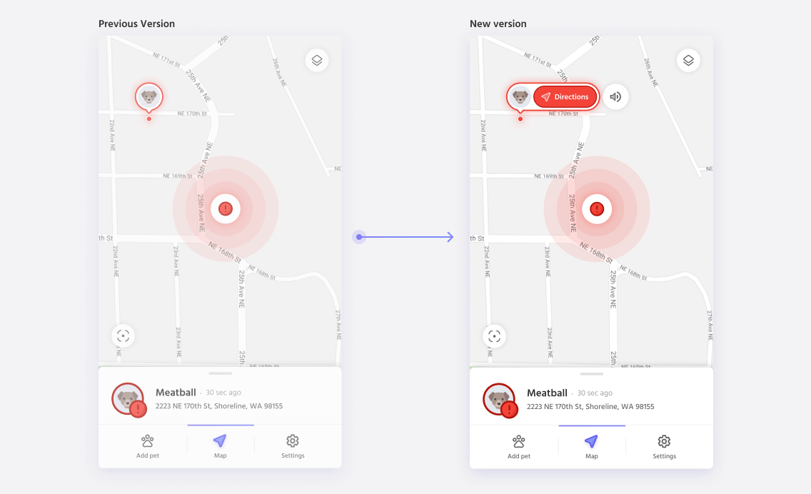
Improved directions: after getting an alert, and checking the app, it's not obvious what the next step is. Users were confused what to do, and where to go.
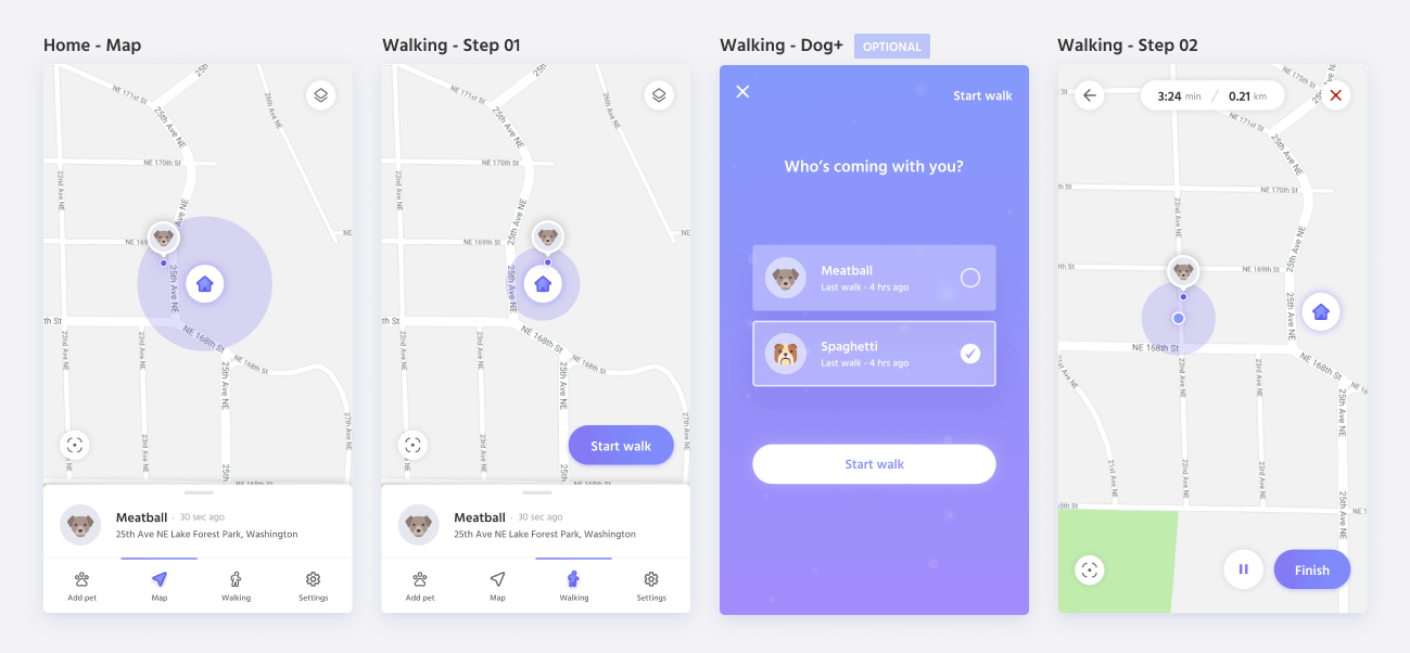
Walking mode: some users suggested a walking mode, where they could tack their routes with their pets. They had to use a running app to do that and were wishing that a more "canine" version would be available.
Creating a plan that is realistic is complex, but can be very valuable during the work. For any projects, creating a roadmap to navigate through what can be a foggy route is invaluable. It saves you time, resources and energy.
Doing research as early as possible prevents issues further down the road. Despite the differences between the users, they mostly shared the same goal: tracking their pets. Understanding who are our users and what are they trying to do is essential in creating great products and experiences. These questions can only be answered by doing user research.
I wished I tested my prototypes earlier. A design exposed to different users (with their opinions, experiences, and criticisms) will unveil multiple problems that you’ll have to solve, ultimately creating a better solution.